Layout with CSS Styles
Lecture notes for IST 286: Web and Digital Media Development
Richard H. Hall, Professor, Information Science and Technology
Missouri University of Science and Technology
- The CSS Box Model
- CSS treats elements as if they were enclosed in an invisible box, comprised of a content area, padding, border, and margin.
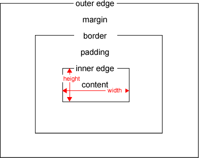
- example
- Nature of the box is partially determined by whether an element is block-level
or inline
- Block-level elements generate a new paragraph and the box goes all
the way across the page.
- block level elements are tags such as <p> and <div>
- Inline elements stay in the same line and do not go all the way
across the page.
- tags such as <span> and <a>
- example with background color
- Block-level elements generate a new paragraph and the box goes all
the way across the page.
- Four basic ways to position an element box:
- static: leave it in the flow
- by default elements will displayed in their order in the .html page
- absolute: remove it from the flow and specify exact coordinates with respect to it's parent
- fixed: remove it from the flow and specify exact coordinates with respect to the browser window
- relative: move the box with respect to it's default position in the flow.
- static: leave it in the flow
- Static (default) positioning
- by default html elements will be displayed in the order that they appears in the html
- static
- Absolute Positioning
- An element is removed from the flow and positioned absolutely with respect to a parent element
- Note:
- User percentages to create "liquid layouts"
- Since absolute elements are taken out of the flow they can overlap
- Positioning is not inhere ted
- At the highest level an element is nested within the <body>
- Percentage Example
- Pixels Example
- Fixed Positioning
- An element is removed from the flow and positioned absolutely with respect to the browser window.
- An element remains in the browser window even when a user is scrolling.
- This would be really cool method of creating the frames effect, but, unfortunately, it is not supported in IE 6.
- Example
- Relative Positioning
- An element remains in the flow, but is positioned relative to where it would appear by default within the flow.
- Other elements are not effected.
- Example
- Background image
- Can use an element as the background for an element
- By default, the background will repeat, but there are number of options
that can change the default, such as positioning and repeat.
- default
- no-repeat
- no-repeat positioned
- fixed (doesn't work in IE 6)
- Border
- Set a border around an element and set the color, thickness, and or style
- Notes
- you can set padding to create space between the content and border
- you can set the border for only one side (e.g., border-top: ...) and can set different properties for different sides (e.g., border-top-style: ...)
- can set all properties at once with border command (e.g., border: 1px solid blue)
- you must type at least a border style for it to display (since the default is none)
- Example
- Padding
- Padding adds space between an element's content and border.
- Notes
- Can add padding differently to different sides
- Can use percentage or pixels
- Example
- Margins
- Margins create space outside the border - between elements and between elements and the browser border
- Notes
- Can add margins differently to different sides
- Can use percentage or pixels
- Can use "auto", which is dependent on the element's height and width. If you set right and left margin to auto, it uses highest possible equal values, so margin can be used for centering.
- When elements are above and below one another, the distance is equal to the greatest margin, not the sum of the margins, (the small margin is said to collapse). Elements side by side do not collapse (the distance is equal to the sum of the margins).
- Example
- Height and Width
- You can specify the size an element will occupy on the page with height and width
- Notes
- Percentages are relative to the size of parent elements
- Padding, borders, and margin are not included in the value of width
- There are maximum and minimum height and width properties, but they are not currently supported well
- The default width (auto):
- for block level elements is width of the parent ("containing block")
- if you manually set width, margin-left, and margin-right
values, and their total does not equal the containing block,
margin-right will be changed to auto.
- you can override this default, by setting margin-left to zero
- you can set both margins to zero and they will have equal maximum values, thus centering an element.
- Example
- Overlap
- By using positioning it is easy to create a situation where elements overlap, you can control which element will be on top by using z-index
- The higher the z-index number, the higher will be the elements position in the stack (highest z-index is on top)
- Notes:
- You can use positive and negative numbers of z-index
- If nested elements have a z-index and parents have a z-index, order is determined first based on the parents, then within the parent box, elements are ordered based on z-index
- Example
- Overflow
- If an element's containing box is not big enough for the content,
you can control where the overflow goes
- visible: expands the box to fit the content - this is the default
- hidden: hides any content that does not fit in the box
- scroll: content outside of the box is initially hidden but can be accessed by scrolling
- auto: this is the same as scroll, except the scroll bars only appear if necessary
- Example
- If an element's containing box is not big enough for the content,
you can control where the overflow goes
- Float
- You can float one element within a sea of text (or other element) to the right or left by using the float property
- Notes:
- Float left means the element will appear in the upper left of the text and float right will appear in the upper right
- In the html, put the element to be floated directly before the stuff it will float in
- If you float two elements in the same direction the first element floated is placed farthest in that direction
- In order for the float property to work, the floated element must be replaced (i.e., an external file like an image) or have an explicit width
- Float is, unfortunately, pretty buggy across browsers
- Example
- You can protect an element from letting anything float next to it
by using clear
- clear right means that nothing can float to a given element's right
- clear left means that nothing can float to an element's left
- clear all means that nothing can float within an element at all
- Example
- Example of using float for arranging main areas of a page (e.g., content and menu)