Mixing and Matching Colors
Based on Jill Morton’s “Color Logic for Web Site Design”
Well, I’ve been reading another e-book by Jill Morton on color, which is, in fact, the most useful book I’ve yet found with respect to practical advice for web design. I highly recommend this book, which is called “Color Logic for Web Site Design”. Most of the information I present below is based on information I got from the book, with a particular focus on color harmony. Although I believe you will find my discussion useful, if you’re interested in a much more comprehensive and detailed discussion of color and web design complete with many example web sites, purchase the book.
Color Wheel
A traditional color wheel consists of twelve colors organized in a specific color. The primary colors are pigments that can’t be mixed by combining other colors. The secondary colors are created by mixing primary colors. The tertiary colors are those formed by mixing the secondary colors. (Figure 1)
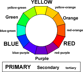
Figure 1. Color Wheel and Types of Colors
Yellow, oranges, and reds are often referred to as warm colors; while greens, blue-greens, and blues are referred to as cool; and the other colors are referred to as in-between.
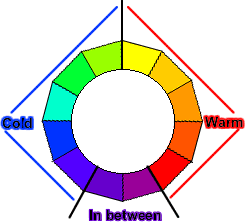
Figure 2. Warm and Cold Colors on the Color Wheel
Color Dimensions
There are three basic dimensions of color. Hue refers to a specific color (e.g., red or blue). Brightness refers to the degree of lightness/darkness of a color (see figure 3 for examples). When two colors are used in a design, the greater the difference in brightness the greater the intensity/dynamics of the contrast. Saturation refers to the degree of purity of a color (see figure 4 for examples). The greater the degree of saturation, the greater the intensity/dynamics of the contrast will be between colors that appear together in a design. We will speak more about the intensity of a contrast below. Figure 3 presents examples of colors.
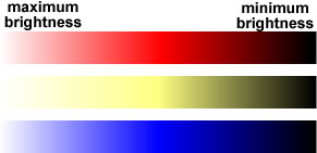
Figure 3. Changes in Brightness
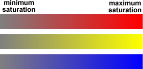
Figure 4. Changes in Saturation
Many graphics programs, such as Macromedia Fireworks® allow you to adjust colors based on these three dimensions. Figure 5 displays a menu that appears in Fireworks which allows for detailed adjustment, with my annotation highlighted in yellow, indicating how these dimensions are represented.
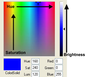
Figure 5. Adjusting Dimensions with Macromedia Fireworks®
Color Harmony
Guidelines
Morton (2001) points out a few basic color guidelines, which I would summarize a) Fewer colors is better. A common mistake is to try and use too many colors; b) A combination of warm and cool colors is generally best (see above); c) The best designs make use of an appropriate balance of dynamic and subtle harmonies. Recall that, as the difference in lightness among colors increases, the dynamics of the contrast increases. Similarly, as the saturation of the colors involved in the contrast increases (not the difference in saturation, but total saturation), the dynamics of the contrast increases. Dynamic harmonies are attention getting and dramatic, whereas subtle harmonies are fluid, low key, and can appear sophisticated.
Types of Harmonies
- Analagous: Three colors side by side. (Figure 6 is an example).
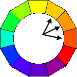
Figure 6. Example of Analagous Colors (yellow-orange, organge, and red-orange)
- Complimentary: Two colors, which are directly opposite each other. (This represents the maximum, most dramatic contrast, in terms of hue.) (Figure 7 is an example).
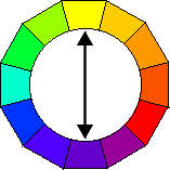
Figure 7. Example of Complimentary Colors (yellow and purple)
- Split Complimentary: One color plus the two colors on either side of its compliment. (This softens the complimentary contrast). (Figure 8 is an example).
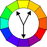
Figure 8. Example of Split Complimentary Colors (yellow-green, yellow-orange,
and purple)
- Triad: Three colors, which are equidistant from each other. These form an equilateral triangle. (Figure 9 is an example).
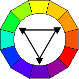
Figure 9. Example of Triad Colors (green, orange, and purple)
- Analogous plus complement: Analogous colors plus the complement of the central analogous color. (Figure 10 is an example).
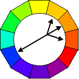
Figure 10. Example of Analagous plus Compliment colors (yellow-orange, orange,
red-orange, and blue)
- Tetrads: Two pairs of complementary colors whose positions form either a square or rectangle on the color wheel. (Figure 11 is an example).
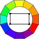
Figure 11. Example of Tetrad colors (green, orange, red, and blue)
- Black and white plus one color: Black, white, or gray with another color added.
References
- Morton, J. (2001). Color Logic for Web Site Design. COLORCOM.