 A competitive firm in the short-run selects
only the output to produce. To maximize profits, each output level must be produced at
minimum costs. The diagram to the left shows these minimum per unit cost curves. There are
four: marginal cost, MC; average total cost, ATC; average variable cost, AVC; and average
fixed cost, AFC. The average curves are the total counterparts divided by the output
level, i.e., ATC = TC/q; AVC = TVC/q; and AFC = TFC/q. The marginal cost is the slope of
the total cost curve, or the slope of the total variable cost curve. They are parallel.
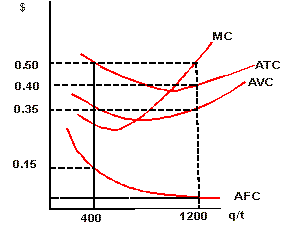
Notice there are important relationships between the curves. A competitive firm in the short-run selects
only the output to produce. To maximize profits, each output level must be produced at
minimum costs. The diagram to the left shows these minimum per unit cost curves. There are
four: marginal cost, MC; average total cost, ATC; average variable cost, AVC; and average
fixed cost, AFC. The average curves are the total counterparts divided by the output
level, i.e., ATC = TC/q; AVC = TVC/q; and AFC = TFC/q. The marginal cost is the slope of
the total cost curve, or the slope of the total variable cost curve. They are parallel.
Notice there are important relationships between the curves.
 | ATC = AVC + AFC, so the vertical difference between ATC and AVC has to equal AFC. |
| Totals can be found by taking the average and multipling by output. Fixed cost is AFC*q,
e.g, at q = 400, AFC = 0.15, so FC = $60. Can you determine AFC at q = 1200? Sure you can,
it's 60/1200 or, 0.05. In a similar fashion you can find TVC at q = 400 as 400*0.35, or
$140, and TC at q = 400 as 400*0.50, or $200. See the difference between TC and TVC is FC,
or $60. |
| The marginal cost curve must cut through the average variable cost and
average total cost at their respective minimum points. |
| Notice that the output where the law of diminishing marginal returns set in is the
output associated with minimum MC (not marked), and the output where average product of
the variable inputs are maximized is the output associated with minimum AVC (not marked). |
| Last, note that the area under MC from the origin to any output level is the TVC of
producing that output level. |
|
|

|
Profit Maximization, Total Approach
|
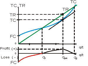 Maximizing
profit means finding the largest difference between total revenue, TR, and
total cost, TC. In perfect competition, TR is linear with a slope equal to
the market determined price. Total cost has a shape determined by the
production function (Ch. 6). Visually it appears profit is maximized at
output qpm. Profit is zero at q1 and q2.
Notice there is a loss equal to fixed cost, FC, when output is zero.
Notice as well, the tangent to TC at qpm. The tangent is
parallel to the TR line and tells us the slopes are equal (see profit
maximization, marginal approach below). Maximizing
profit means finding the largest difference between total revenue, TR, and
total cost, TC. In perfect competition, TR is linear with a slope equal to
the market determined price. Total cost has a shape determined by the
production function (Ch. 6). Visually it appears profit is maximized at
output qpm. Profit is zero at q1 and q2.
Notice there is a loss equal to fixed cost, FC, when output is zero.
Notice as well, the tangent to TC at qpm. The tangent is
parallel to the TR line and tells us the slopes are equal (see profit
maximization, marginal approach below). |
|
|
Profit Maximization, Marginal Approach
|
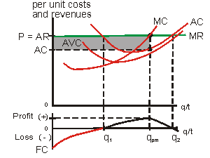 The
marginal approach starts with the principle equate benefits and costs
on the margin. In the case of perfect competition, the decision
variables are, the mix of inputs to produce its output, and the choice of
output. The diagram shows the firm's per unit cost curves: MC, or
marginal cost; AC, or average cost; and AVC, or average variable costs.
These costs are derived from the least cost choice of inputs. The firm now
compares the costs on the margin with their benefits on the margin, in
other words, they compare MC with Marginal Revenue, MR. In perfect
competition Marginal Revenue equals price. Profit is maximized at qpm
where MC = MR. At output levels less than qpm, MC is less than
MR so expansion of output adds more revenue (MR) than costs (MC). At
output levels greater than qpm, profit is increased by reducing
output since the reduction in revenue, MR, is less than the reduction in
costs, MC. Notice in the per unit diagram, profit must be calculated
rather than reading it directly from the vertical axis as is the case in
the "total approach" shown above. Profit is the shaded area in
the per unit diagram and equals average revenue minus average cost times
output. In symbols, profit = (AR - AC)*(q). The
marginal approach starts with the principle equate benefits and costs
on the margin. In the case of perfect competition, the decision
variables are, the mix of inputs to produce its output, and the choice of
output. The diagram shows the firm's per unit cost curves: MC, or
marginal cost; AC, or average cost; and AVC, or average variable costs.
These costs are derived from the least cost choice of inputs. The firm now
compares the costs on the margin with their benefits on the margin, in
other words, they compare MC with Marginal Revenue, MR. In perfect
competition Marginal Revenue equals price. Profit is maximized at qpm
where MC = MR. At output levels less than qpm, MC is less than
MR so expansion of output adds more revenue (MR) than costs (MC). At
output levels greater than qpm, profit is increased by reducing
output since the reduction in revenue, MR, is less than the reduction in
costs, MC. Notice in the per unit diagram, profit must be calculated
rather than reading it directly from the vertical axis as is the case in
the "total approach" shown above. Profit is the shaded area in
the per unit diagram and equals average revenue minus average cost times
output. In symbols, profit = (AR - AC)*(q). |
|
|
Profit Maximizing Adjustments to a Change in Demand
|
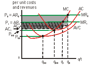 Suppose
the market determined price is P0. Using the marginal approach,
the firm selects q0 as the profit maximizing output. If demand
falls, the market clearing price falls and the firm adjusts to the lower
price by reducing output. In the diagram, it is assumed the price falls
from P0 to P1 and the firm adjusts its output from q0
to q1. Notice profits falls from the gray area to the darker,
hatched gray area. If demand and price were to continue to fall, the firm
would respond by reducing its output. At price PBE, the firm
breaks even, as price, or average revenue equals average cost. Profits are
zero, but all opportunity costs are covered. If demand continues to fall,
the firm will continue to respond by lowering output, but now considering
whether it losses less by operating or by shutting down. As long as price,
or average revenue, covers variable cost, it pays the firm to operate.
This remains true unless price were to fall below average variable cost.
Price, PSD, is called the shut down price because at this
price, average revenue equals average variable cost. If the firm operates
at output qSD, they lose as much as if they were to shut
down--their loss would equal their sunk costs. Between PBE and
PSD the firm losses money, but less than if they shut down.
Notice that the output response to a change in demand induced price,
follows the portion of the firm's short-run marginal cost curve above its
average variable cost curve. By summing horizontally this portion of each
firm's marginal cost curve we derive the market short-run supply curve. Suppose
the market determined price is P0. Using the marginal approach,
the firm selects q0 as the profit maximizing output. If demand
falls, the market clearing price falls and the firm adjusts to the lower
price by reducing output. In the diagram, it is assumed the price falls
from P0 to P1 and the firm adjusts its output from q0
to q1. Notice profits falls from the gray area to the darker,
hatched gray area. If demand and price were to continue to fall, the firm
would respond by reducing its output. At price PBE, the firm
breaks even, as price, or average revenue equals average cost. Profits are
zero, but all opportunity costs are covered. If demand continues to fall,
the firm will continue to respond by lowering output, but now considering
whether it losses less by operating or by shutting down. As long as price,
or average revenue, covers variable cost, it pays the firm to operate.
This remains true unless price were to fall below average variable cost.
Price, PSD, is called the shut down price because at this
price, average revenue equals average variable cost. If the firm operates
at output qSD, they lose as much as if they were to shut
down--their loss would equal their sunk costs. Between PBE and
PSD the firm losses money, but less than if they shut down.
Notice that the output response to a change in demand induced price,
follows the portion of the firm's short-run marginal cost curve above its
average variable cost curve. By summing horizontally this portion of each
firm's marginal cost curve we derive the market short-run supply curve. |
Perfect Competition, Long-Run Adjustment to an Increase in Demand
|
| 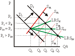 The short-run
equilibrium is P1 and Q1 (note the uppercase Q
to denote market output rather than firm output). Demand increases
from D1 to D2 and in the short-run existing
firms increase their output to obtain a new short-run market
equilibrium of P2 and Q2. If we assume the
original equilibrium was long-run as well as short-run, it was
associated with zero economic profits. The new equilibrium (P2
and Q2) is then associated with positive profits and
attracts new firms. The market short-run supply, SSR,
increases (shown in red) and price falls
as the new supply enters the market. The price will continue to fall
from P2 until zero profits are earned by the typical firm.
The new, long-run equilibrium price can have three relationships with
the original equilibrium price P1depending on the nature of
the market long-run supply curve, LRS (3 cases shown in green). The short-run
equilibrium is P1 and Q1 (note the uppercase Q
to denote market output rather than firm output). Demand increases
from D1 to D2 and in the short-run existing
firms increase their output to obtain a new short-run market
equilibrium of P2 and Q2. If we assume the
original equilibrium was long-run as well as short-run, it was
associated with zero economic profits. The new equilibrium (P2
and Q2) is then associated with positive profits and
attracts new firms. The market short-run supply, SSR,
increases (shown in red) and price falls
as the new supply enters the market. The price will continue to fall
from P2 until zero profits are earned by the typical firm.
The new, long-run equilibrium price can have three relationships with
the original equilibrium price P1depending on the nature of
the market long-run supply curve, LRS (3 cases shown in green). |
| Empirically, the most common case is the constant-cost industry
where the average costs of the typical firm is unaffected by market
output. Short-run supply continues to expand until profits are zero.
Since costs are not affected by the expansion of market output,
long-run equilibrium occurs when price is restored to its original
level. Note, however, that market output is now Q4 not Q1. |
| When average costs and market output are inversely related, we have
what is referred to as a decreasing-cost industry. Here again, the
increase in demand calls forth an increase in price and quantity in
the short-run (from P1, Q1 to P2, Q2).
And again, positive profits attract additional sellers. Long-run
equilibrium is restored, but in this case, since the increase in
market output lowers the average cost of a typical firm, the
long-run price is less than the original price (PDC < P1)
and output expands to Q5. |
| When average costs and market output are positively related, we have
what is referred to as an increasing-cost industry. As before, the
increase in demand calls forth an increase in price and quantity in
the short-run (from P1, Q1 to P2, Q2).
And again, positive profits attract additional sellers. Long-run
equilibrium is restored, but in this case, since the increase in
market output increases the average cost of a typical firm, the
long-run price is greater than the original price (PIC >
P1) and output expands to Q3. |
|
|
|