Graphs
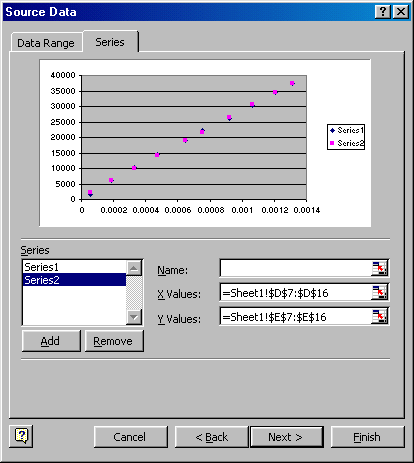
We shall now display our experimental data and our least squares line on a graph. Select Insert, Chart..., and then choose a XY (Scatter) graph. The sub-type without lines is fine. Press Next, and selected the Series tab. Add a series, and select cells D7 to D16 as the X values and cells C7 to C16 as the Y values. You can select the cells by clicking on the spreadsheet icon to the right of the X and Y-value labels. Add a second series, use the same X values, and select cells E7 to E16 as the Y values for this series.
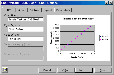
Select Next, and fill in the graph titles. You may leave the other options in their default settings or modify them if desired.
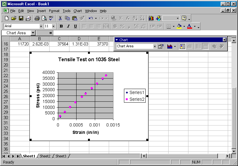
Select Next, accept the default of inserting the graph into the current sheet, and select Finish. You will now want to move the graph to a convenient location on the sheet so as not the cover the numeric data. You may also want to increase the size of the graph by dragging one of the corners.
The appearance of the graph leaves much to be desired, so we will work on that next. With the graph selected, deselect the Legend icon on the Chart toolbar. Click on the main title and change the font size to 12. To change the font size, select the Format icon on the Chart toolbar. Likewise, change the font size to 10 for the axis titles and axis numbers. You may leave the other options in their default settings or modify them if desired.
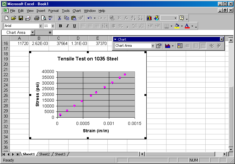
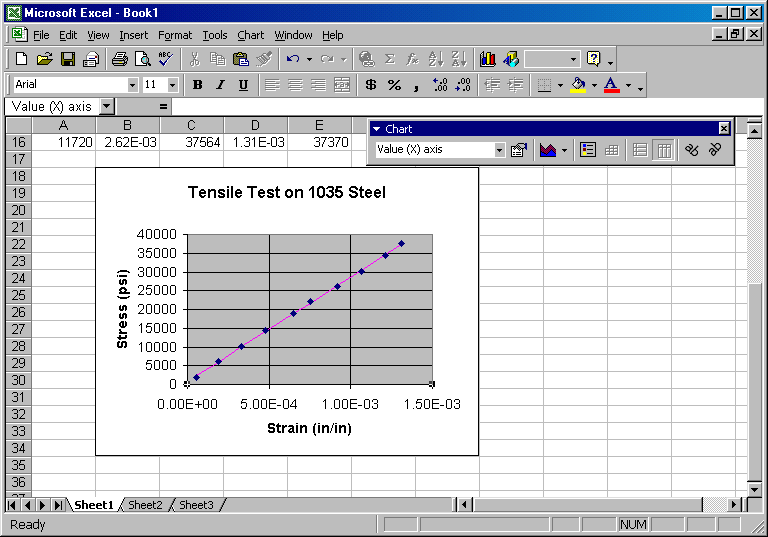
The original data set (Series 1) will be displayed without connecting lines, since we selected a scatter chart without lines. However, you will want to modify the linear regression data set (Series 2) to display only the line (no data points). Click on the data points of the linear regression data and select the Format icon. Select the Patterns tab, the Automatic line option and the None marker option. Click OK to return. The display should look like the following:
You can continue to modify items using the Chart toolbar and/or Format menu until you get the desired results.