Fundamentals
The spread sheet is composed of a matrix of cells with numbers identifying the rows and letters of the alphabet identifying the columns. While it is possible to change the size of the cells, we will leave them at the default size (eight characters) for the time being.
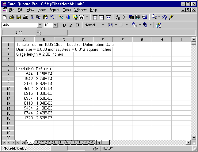
It is a good idea to leave the first few rows for text. Try to duplicate the following data set. The text may extend beyond the length of the cell. In the example the text is in cells A1, A2, and A3, although it appears to be in cells B, C etc.
In order to get the deformation data to display in the scientific mode, highlight cells B7 through B16. You can highlight the group by placing the mouse cursor in cell B7, holding the mouse left button and dragging to cell B16, and then releasing the button. Now click on Format, Selection, Numeric Format, and then click on the button for Scientific and select 2 decimal places and click on OK. Enter the text and data as it appears in the example:
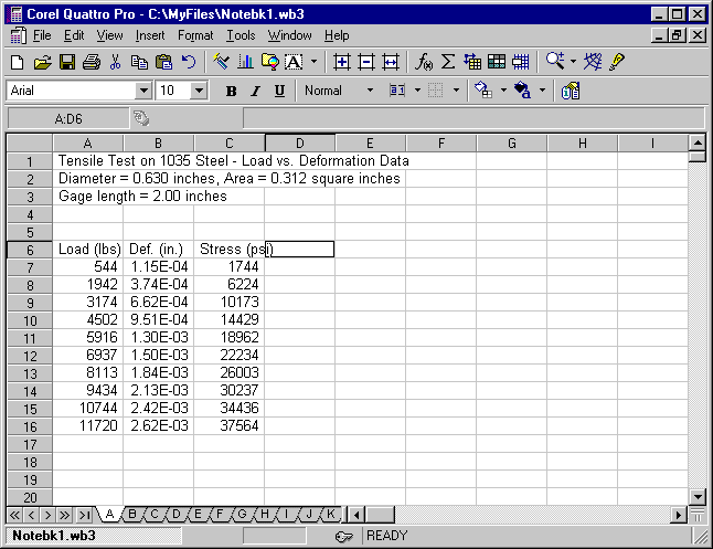
Now we want to add columns for stress and strain. Move the cursor to cell C6 and type Stress (psi), and hit enter. This puts the caption for the stress column in the cell. Next move the cursor to cell C7 and click on the f(x) button at the top of the screen. This opens a Formula Composer window where you can type +A7/0.312 and click on OK to return. You should see the stress 1743.59 in cell C7 while the formula is displayed on the line immediately above the column letters. Select cell C7 with the cursor and click on Copy. Highlight cells C8 through C16 and click on Paste. You should now have a column of stress values. Change the formatting by highlighting cells C7 through C16 and then clicking on Format, Selection, Numeric Format, Fixed, select 0 decimal places, and click OK.
Examination of the display line (above the column letters) will show the appropriate equation for each cell. For example, move the cursor to C8 and observe that the value in the cell is 6224 but the equation displayed at the top is +A8/0.312. Similarly, as you move down the column you will observe that the copy command changes the cells used for the computation each time. The spread sheet copy command assumes that computations involving cells are repetitive and thus the program increments cells used in the calculations. Thus, only one equation needs to be entered, and then copied using the copy command.
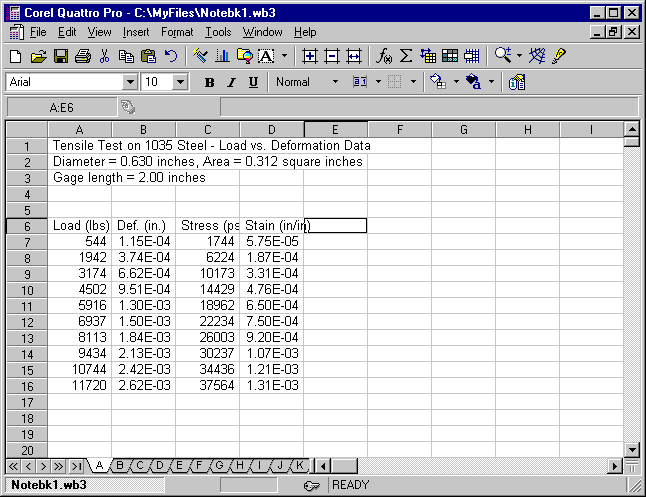
Move the cursor to cell D6 and type Strain (in/in) and hit enter. Next move the cursor to cell D7 and click on f(x) to open the Formula Composer window. Type in +B7/2.00 and click on OK to return. Replicate the calculations by placing the cursor on cell D7 and click on Copy. Then highlight D8 through D16 and click on Paste. You should now have a column of strain values. You might want to format this column to scientific notation with two decimal places. Your data should now look like the following:
Linear Regression
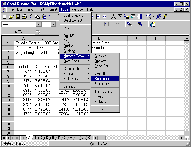
Now that we have generated our stress vs. strain data, we would like to generate a best fit line of the data (i.e. a linear regression curve). Select Tools, Numeric Tools, and Regression. Select (by highlighting or typing) as Independent variables D7..D16, and Dependent variables C7..C16, and indicate cell F6 as the Output location. Accept the default compute for the y-intercept and click on OK.
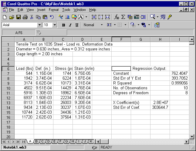
Your linear regression results will appear to the right of your data set in the cell block F6..I14. Your spreadsheet should look like the following:
If we want the linear regression line to appear on the graph, we will now have to generate the linear stress data corresponding to the experimental strain values, i.e. the theoretical y values for the given x values. That is, we need to generate the values of
stress = m (strain) + b ( i.e. y = m x + b )
where the slope m is the X Coefficient from the Regression Output and the constant b is the Constant from the output. In the example, the slope is in cell H13 and the constant is in cell I7.
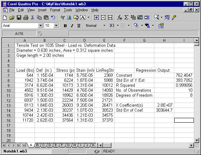
Label cell E6 as LinRegStr (for linear regression stress). Now move the cursor to cell E7 and click on f(x), the Formula Composer, and type +$H$13*D7+$I$7 and click on OK to return. This equation multiplies the slope stored in H13 by the strain value in D7 and adds the intercept slope constant stored in I7. The $ signs anchor the slope and intercept cells so that they will not increment when we copy the equation to other cells.
Now select E7, click on Copy. Highlight E8..E16 and click on Paste. You should now see numerical values of stress in column E. These values will be used in conjunction with the strain values to plot the linear regression line. Before proceeding, clean up the formatting by highlighting E7..E16, click on Format, Selection, Numeric Format, Fixed, select 0 decimal places and OK. Your spreadsheet should now look like the following:
Our computational work is now complete. All that remains is to display the data in the graphical format of our choice.
Graph
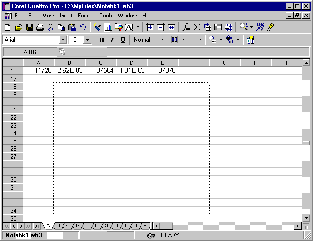
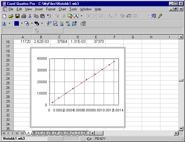
We shall now display our experimental data and our least squares line on a graph. First, ensure the curser is in a blank cell. Otherwise, the program will try to automatically create a graph, and the remainder of these steps will differ from what you see on the screen. Select Insert, Chart..., and you will have the following:
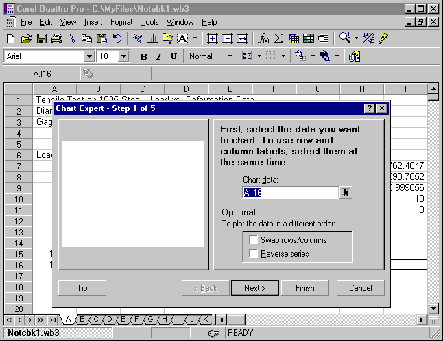
Select Finish and highlight cells B19..F34.
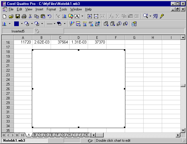
This will insert a blank chart into the spreadsheet, which will later be printed on the same page as the numeric data.
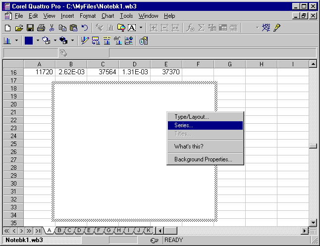
Right-click on the chart and select Series....
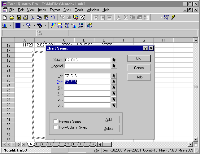
For the X-Axis Series select D7..D16 (can be done by clicking on the arrow to the right of the X-series box and then highlighting the area D7..D16). For the 1st Series select C7..C16 and for the 2nd Series select E7..E16.
Click on the OK and the following appears:
At this time, insure you are using an "XY" graph and not a "Line" graph. Right-click again and select Type/Layout..., Specialty, XY. A "Line" graph will not provide a uniform spacing on the x-axis, thereby making the linear-regression line not appear straight.
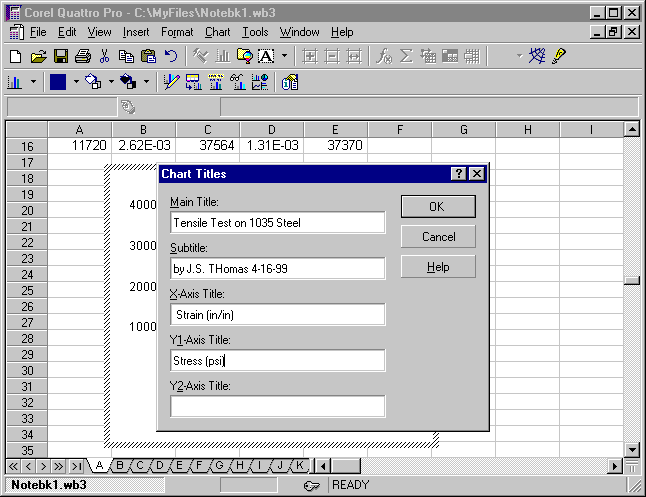
Right-click and select Titles... and type the Main Title, Subtitle, X-Axis Title and Y-Axis Title for the graph.
Click OK to see the results.
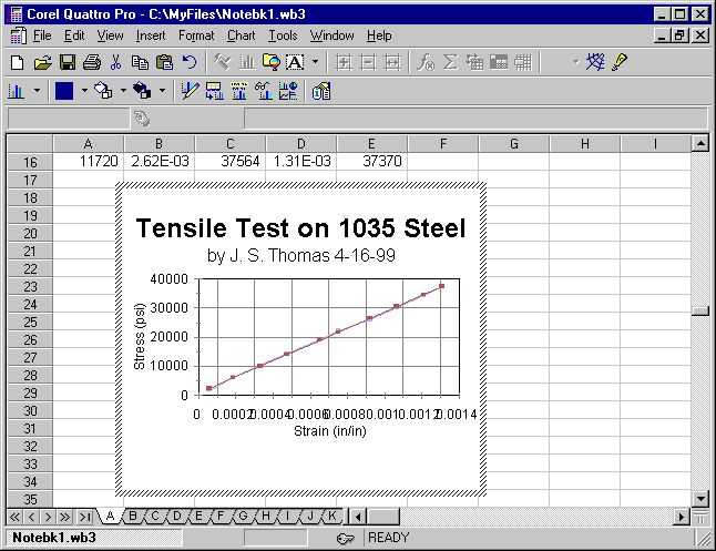
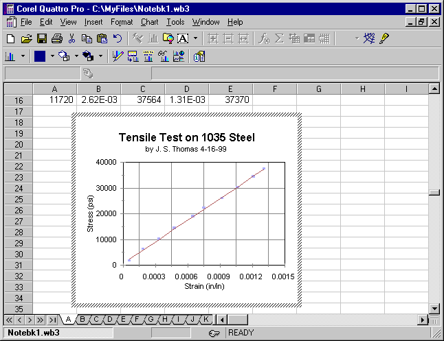
On the graph, click on the main title and change the font size to 24 pt. Likewise, change the font size to 16 pt. for the subtitle, axis titles, and axis numbers. To modify the scale, numerical format, spacing, etc. for the axes begin by clicking on Chart. Select Axes, then X-Axis, and select Scale. Set the High value to 0.0015 (slightly higher than the largest strain), leave the Low value at zero, and set the Increment to 0.0003. You may leave the other options in their default settings or modify them if desired.
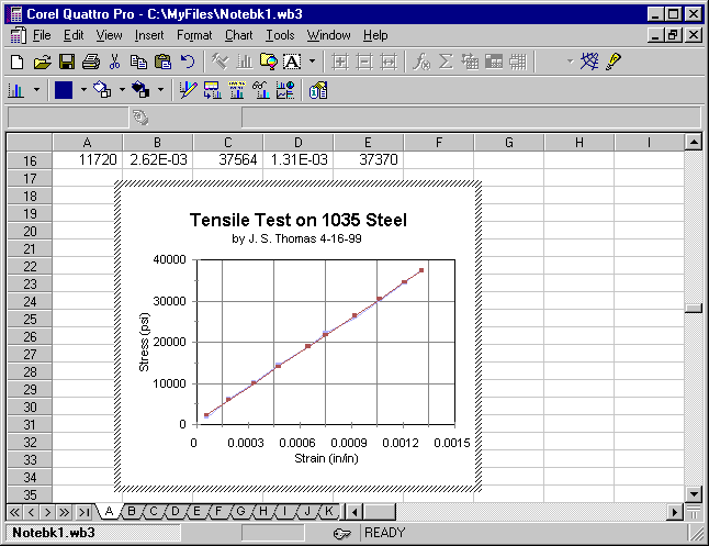
Since the y-axis values are already scaled from 0 to 40,000, there is no need to modify the scale unless you want. The y-axis may be modified by repeating the above process choosing Primary Y-Axis. To display the original data set without connecting lines, click on the data points or line of the original data set and choose Format, Selected Object. The original data set was the 1st series (C7..C16). Choose Line Settings, no line (the first choice), and click OK to return. The display should look like the following:
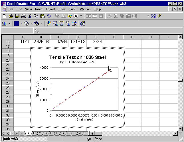
You will also want to modify the linear regression line to display only the line (no data points). Click on the data points or line of the linear regression data and choose Format, Selected Object as before. The linear regression data set was the 2nd series (D7..D16). This time choose Marker Style, and unselect AutoSize. Move the slider all the way to the left to give the linear regression data markers a weight of zero (i.e. they will not appear). Click OK to return. The display should look like the following:
To view the graph full screen strike the F11 key. After viewing the graph click the mouse or hit any key to return to the spreadsheet where you can continue to modify items using the Chart and/or Format menus until you get the desired results.
Printing
To print the spreadsheet data and graph, simply click on the Printer Icon or click on File and select Print, following the instructions on screen. If desired, you can also select File and Print Preview to verify the appearance of your document before sending it to the printer.
With a little practice and experimentation you should be able to quickly and easily create professional-looking spreadsheets and graphs.